Idea: Desktop Wallpaper Design Divergent-Convergent Thinking Exercise
 I have an idea for a YCISL Divergent-Convergent Thinking Exercise. Along with DCT, this exercise also involves brainstorming, rapid prototyping, fast thinking, design thinking, creativity and eq. We could also add an elevator pitch component with storytelling and your personal story elements.
Overview: In Canva, create a desktop wallpaper. We could assign various scenarios based on purpose and context.
Instructions: Divergent Phase: In Canva, set up a blank desktop wallpaper template. Add your text. Play with the font styles coming up with various prototypes. With the font prototypes, play with various color schemes for the text and monochrome background. As a last step, create versions with background images. Convergent Phase: Identify up to three prototypes that you think resonate the most. The criteria are up to you. Pitch Phase (optional): Design a 90-second elevator pitch around these selected prototypes providing a feature list, a story and an explanation of how it connects to your personal story. Assess the level of creativity, growth and mindfulness involved in this exercise.
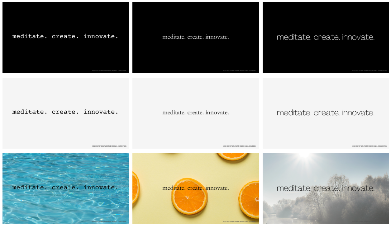
I may have a chance to try this exercise out this summer in Sustainability Design Thinking. In the meantime, I will describe my experience reflected by the 9 designs in the gallery above in this wiki entry.
- I started off with a black background to have lower computer screen glare. I also think a black background has a sophisticated vibe.
- I chose three words related to the YCISL and intentionally selected words that rhymed so that they bounce around in the head together. I also feel the expression has a connected 3-step progression so there is an element of active listening (hearing, listening & understanding) involved.
- I actually created 16 prototypes based on font type. The three font types shown in the gallery at the top are Courier Prime, Garamond and Agrandir Thin representing the more common type styles.
- I then made a copy of the set of 16 prototypes and changed the background to white. As I started working on this WordPress entry, I found that I preferred having some contrast between the wiki image and the wiki background, and made another set with an off-white background (#f5f5f5). I feel both the white and off-white background sets work well. Putting a little red, blue or green tint would have been an interesting expansion, but I didn’t do it. That’s because I like to design exercises with sets of 3, and the 3rd step in this exercise is to…
- Use images for the background. Again, I did actually create 16 prototypes with various backgrounds, and the three shown in the gallery above are just by chance the ones for the three basic font typefaces. Still, I like the variability represented here where the water has a cool and dynamic feel, the orange slices image touches most of our senses, and the scenery background denotes place and time.
Another important note is that even with 16 font typefaces and three variations on the background, there is learning happening in this exercise. Preferences, new ideas and intrinsic motivation are being exposed. So if there is enough time in this exercise to conduct a second DCT cycle, that would be consistent with the way we do the Spaghetti Tower Marshmallow exercise (“Fail Early, Fail Fast”) as part of rapid prototyping.